

According to Donner, the tool was developed after the team identified a gap in the market for an analytics product that helped the client to make a quick overall assessment of the current liquidity picture. This enables clients for the first time to see a visualisation of the market conditions on screen, allowing them to easily view whether now is a good time to trade using an algo or whether it would be better to opt for a risk transfer instead.
“We were thinking about an earlier visual structuring product that we had built with options in mind. With an option you take risk in order to achieve a payoff. Then the penny dropped! It is the same motivation for an algo. You take risk in order to outperform a benchmark, typically risk transfer. You can even control this payoff profile by setting a limit price on an algo, rather like an option’s strike. And as with an option, a key driver for whether you achieve your payoff is market volatility! I’m simplifying a bit, but an algo starts to look like a supersonic option , one with an expiry in minutes versus months,” Donner says.
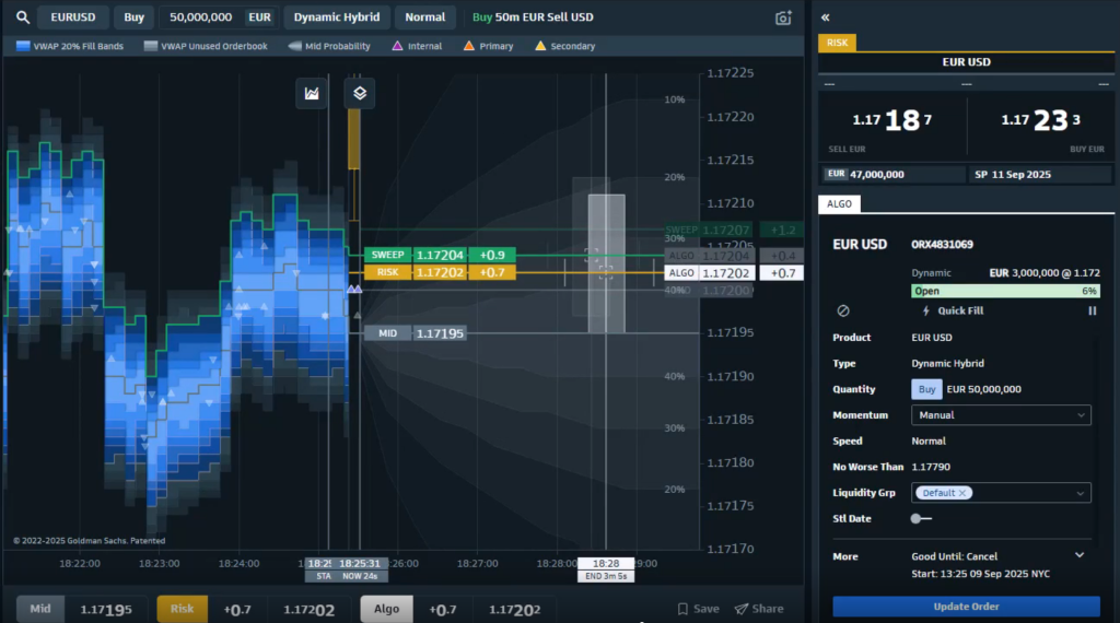
The end result is what can be seen here on the screen [Figure 1]. Donner explains that the client can input the order amount at the top, for example 50 million EUR/USD, then they can optionally choose the algo that they might want to use – dynamic hybrid or some other alternative – and even select the speed if required. The screen is divided into two sections. On the left hand side is an aggregated order book for this market, which combines all the different venues in which the client could trade EUR/USD, adds Donner.
Some clients might consider an aggressive sweep algo. “The line in the centre shows the mid price, then the different shades of blue display how far through market the client would need to go in order to get 10 million of that 50 done, 20 of that 50 done and so on,” he says.
“That in itself is interesting information,” Donner adds. For example, in this case the first lightest blue band is relatively wide compared to the next darker colour blue band, which is telling the client that they need to go fairly far from mid in order to get 10 million done,” he says. “It gives me a sense of the order book structure at a glance, not just the overall spread picture, but a structured view of what that market’s like,” Donner adds.

In addition, if Goldman Sachs is streaming a risk price in the requested size then that is also visible on the screen. “This is represented by the orange band that crosses the screen, that is our risk price in that size,” Donner says. That price is client-specific, it will be their own price displayed rather than a generic one. If it is technically possible to sweep the order book in order to be filled in this size, then that is also indicated on the screen with a green bar, and if a sweep would lead to partial fill, that is shown too [Figure 2], Donner adds.
Beyond the immediate execution options, there is also a ‘volatility cone’ visible on screen. This serves to indicate where the market might end up and what the algo duration would be to run an algo if the client wanted to do that, Donner says. The other component is
cost, he adds. “The algo has an element of uncertainty, unlike a risk price which is firm, you trade it and you are done at that point, so it’s just a line,” he explains. “The algo, on the other hand has a range of possible outcomes.”
This band of possible outcomes is shown on screen as a shaded box plot on the right-hand side. The boxplot is like a target zone for this algo, where it is expected to land in duration and achieved price.
The height of the box represents the uncertainty in the cost of execution, while the width represents the uncertainty in duration, notes Donner.
The cross hairs in the centre then marks the median outcome of both of those elements, with the top and bottom of the box representing respectively the 25th percentile worst and the 75th percentile best outcomes. The whiskers extending from the box end in the 5th and the 95th percentile outcomes, to provide a transparent view into unusually bad and good performance.
“It offers a very transparent way of seeing what the algo performance has been like in this size with the GS Dynamic Hybrid,” Donner says.
Donner explains that tool has also proven powerful in helping to improve client education around the effective use of algos, often demonstrating to clients that there are numerous opportunities where an algo would have outperformed a risk transfer, but common misconceptions, such as the expected optimum order size for algo execution which actually varies significantly by currency pair. He adds: “This tool is also useful for prospective algo clients who can start by experimenting with this tool in order to see how do our algos perform versus our risk pricing, that can then lead that conversation forward. It is a very transparent way to demonstrate how algo execution actually performs.”
There is also no one size fits all when it comes to how clients utilise the tool, he adds. Donner suggests starting with the orange line and seeing how much of the box plot it intersects.
“In the EURUSD example, the orange risk transfer line lies almost in the centre of the crosshairs. This means there is about a 50% chance of algos outperforming risk transfer. At this moment, it may not be worth doing an algo. By contrast in the USDKRW example, 33% of the algo distribution lies above the risk line. Our estimated probability of an algo outperforming risk is 67% in this case.” Donner says. “This level of visualisation is entirely new but it is exactly what the client is looking for. When they look at analytics, they are trying to work out whether executing with an algo Is a good idea and if it will beat the benchmark. It is a heads-up display that illuminates a moving target. For our clients it means the confidence to pick the right instrument and to pull the trigger,” he concludes.
